Usage
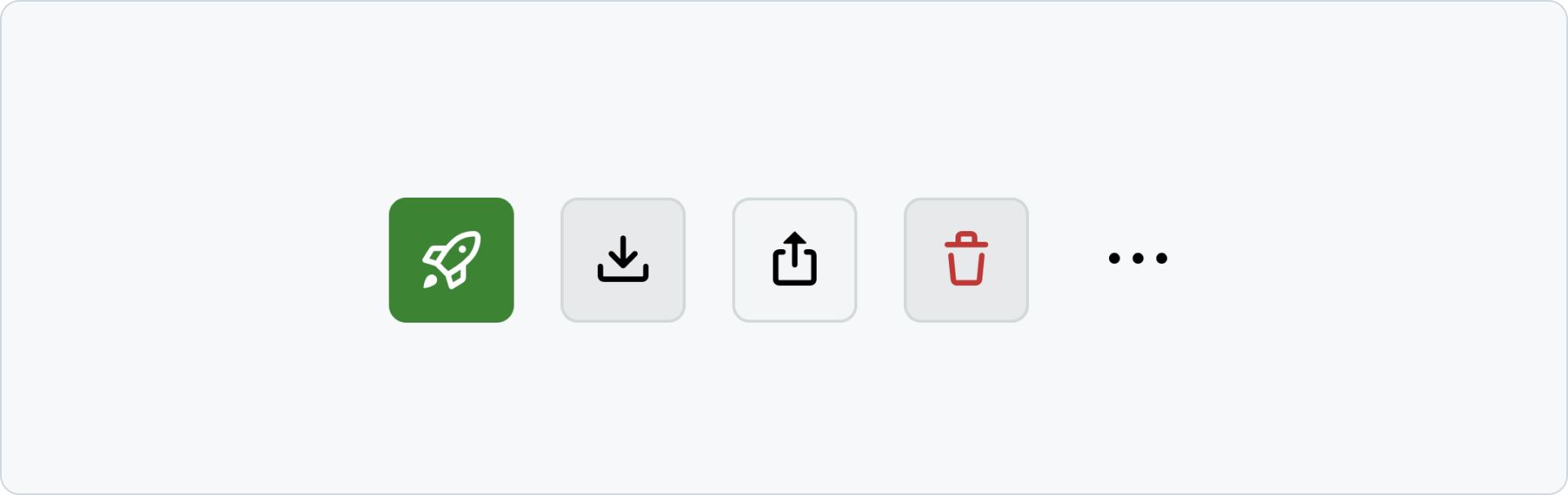
Icon buttons represent an action with an Octicon instead of a visible text label. Always choose a familiar Octicon whose meaning is clear in context. Otherwise, use a button with a visible text label.
Every icon button displays a tooltip on hover and keyboard focus. The tooltip repeats the accessible label by default, helping users confirm the action before activating it.
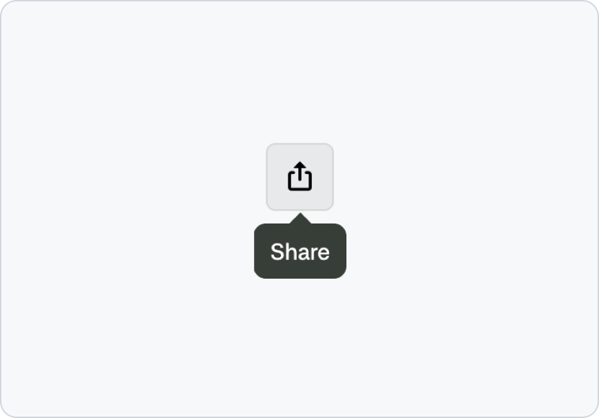 Use an Octicon that clearly represents the action.
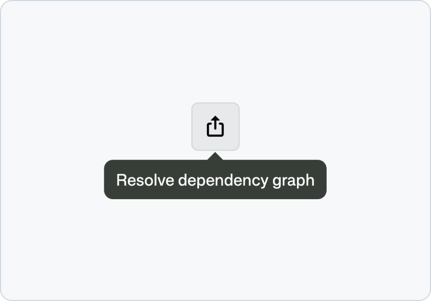 Don’t pair a familiar Octicon with an unrelated action.
Labels
Every icon button needs a concise name that describes what happens when someone activates it. Begin with a clear verb when possible, such as Search, Share, Close, or Delete item.
Describe the action rather than the icon’s appearance. Keep supplementary tooltip text short and non-essential.
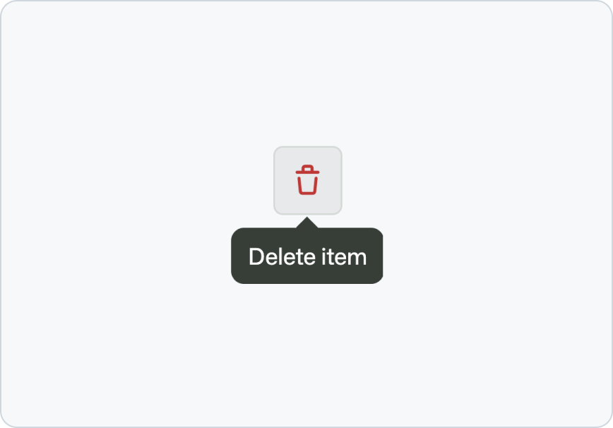 Describe the action the button performs.
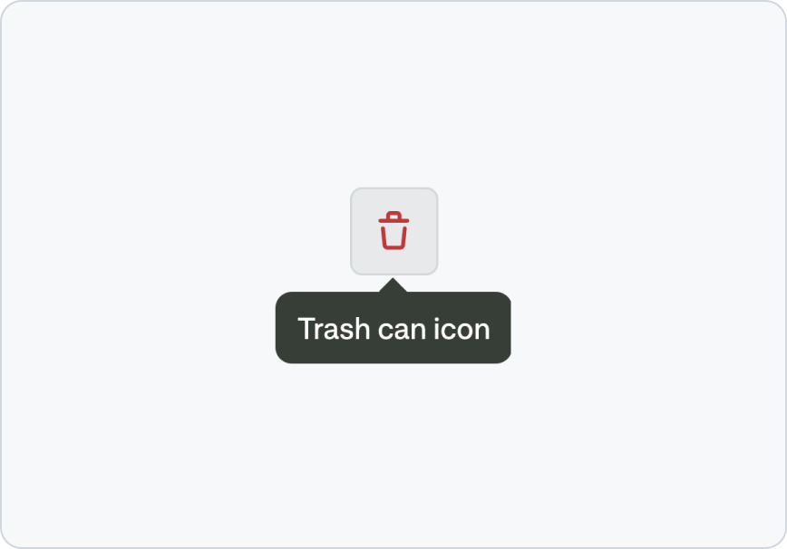 Don’t describe the icon’s appearance.
Hierarchy and emphasis
Use the default visual appearance for most icon buttons. Only use the stronger accent colors for the highest-priority action in a group.
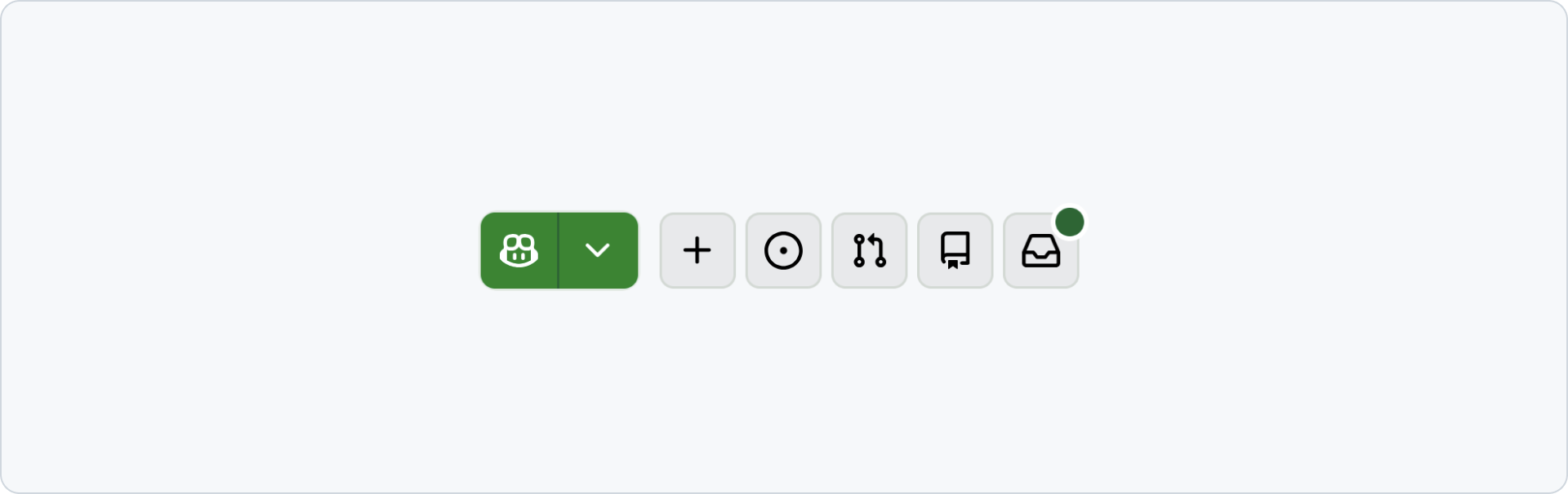
Reserve danger styling for destructive actions. The icon and accessible name must still communicate the destructive outcome without relying on color alone.
Use the invisible appearance only when the surrounding interface already provides enough structure and the control remains discoverable in every interaction state.
Grouping
Join closely related peer actions so their relationship is visually clear. Keep unrelated actions separate and provide enough space between their targets.
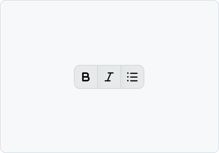 Join closely related icon buttons into one group.
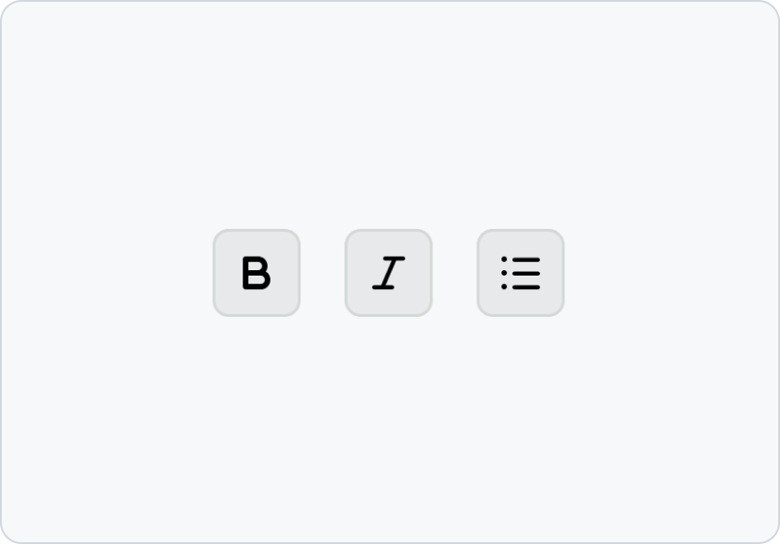 Don’t separate icon buttons that represent one related set of actions.
Shape
Icon buttons are available in two shapes, with square the default.
Use the standard square shape for most use-cases. Use a rounded shape only when it matches an established interaction pattern, such as sending a chat message or advancing through media quickly.
Keep shape consistent among related controls. Do not use shape alone to communicate an action’s meaning or state.
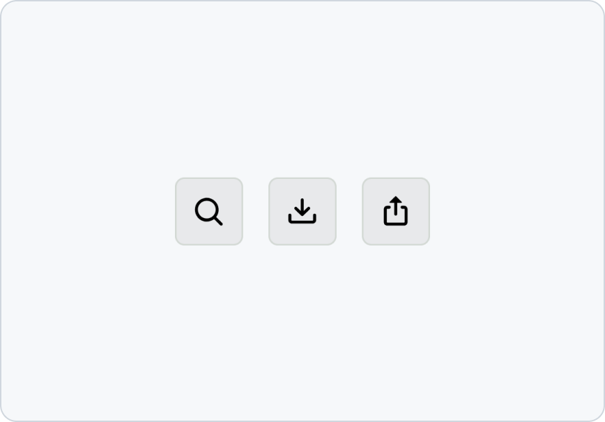 Use a consistent shape for related icon buttons.
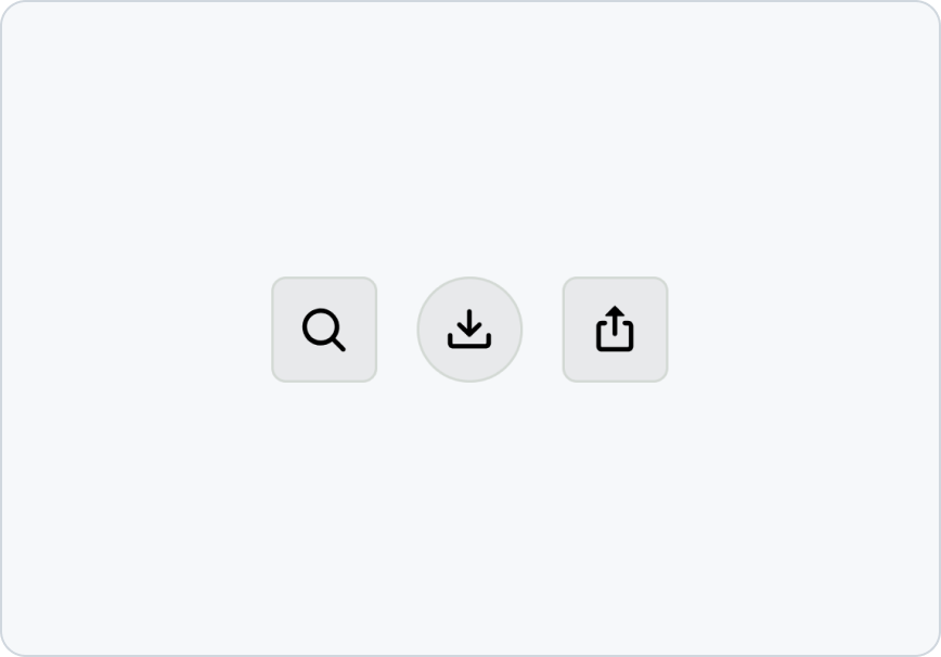 Don’t mix shapes unless the difference communicates an established pattern.
Loading
Show progress in place when an action takes time to complete. Keep focus on the control, prevent repeated activation, and announce that work is in progress. Use a specific announcement when the surrounding context does not make the operation clear.
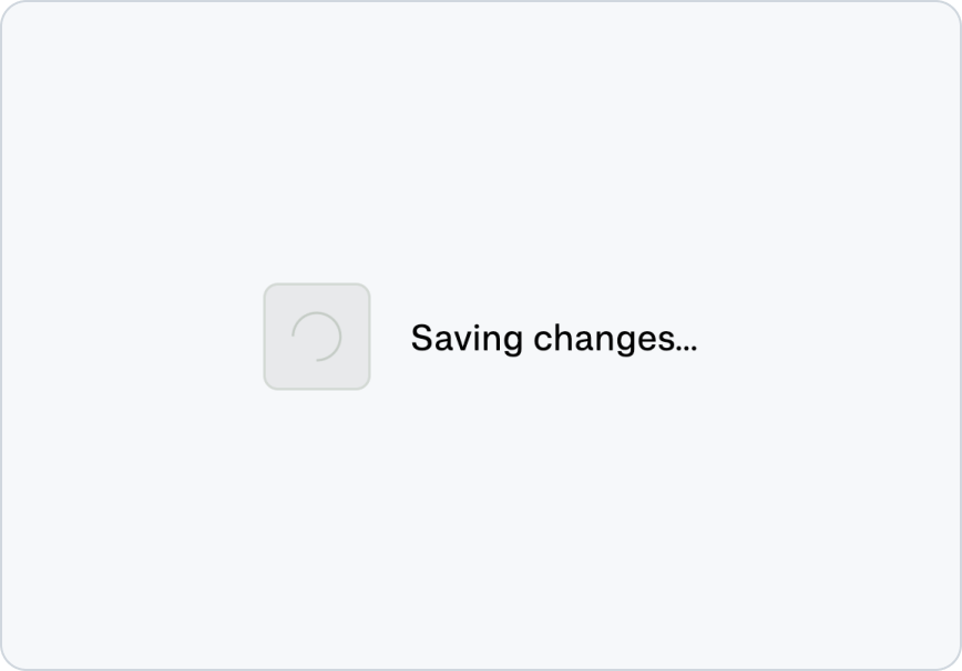 Replace the Octicon with a loading indicator while the action is in progress.
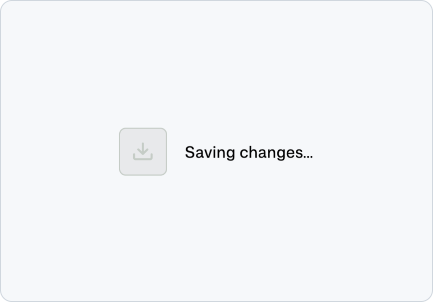 Don’t use only disabled styling to communicate that an action is in progress.
Accessibility
- Give every icon button an accessible name, even when the icon seems self-explanatory.
- Ensure the name describes the action and remains accurate when the button’s state changes.
- Keep the tooltip available on both pointer hover and keyboard focus.
- Ensure the control has a visible focus indicator.
- Maintain at least a 24x24 pixel target size and provide enough spacing from nearby controls.
- Treat the Octicon as decorative because the accessible name communicates the purpose.
- Do not rely on color, shape, or iconography alone to communicate state.
Related components
- Button: For actions with a visible text label.
- Button group: For a set of closely related actions.
- Tooltip: For guidance on concise labels and supplementary information.
- Octicons: For the icon library used by icon buttons.